Client: Emerson
Platform: Android Google Tablet
Deliverables: Tablet mockups and prototype, customer interviews, interview summaries
Challenge: Revamp legacy software and design from the early 90's without access to the current software due to client's strict security protocols. Working in a tight timeframe on a strict budget.
Objective: Upgrade Everest Machinery Health Analyzer UX/UI in accordance with 2140 Routes desktop software.
To learn more about the origin of Everest click here. Our design efforts are estimated to be fully in place by 2025-2026.
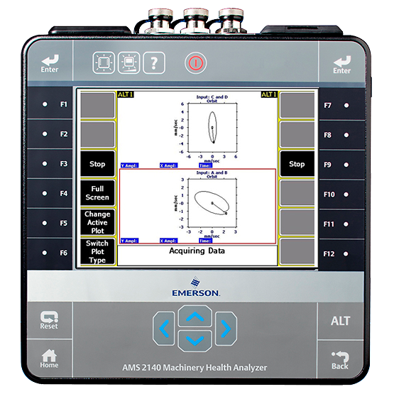
Everest is the newest version of the 2140 Machinery Health Analyzer, which will soon be operated via Google Tablet using our interface redesign. Field technicians use Everest to measure data from industrial machines, which then is analyzed from the Machine Works Desktop Software.
BEFORE AND AFTER
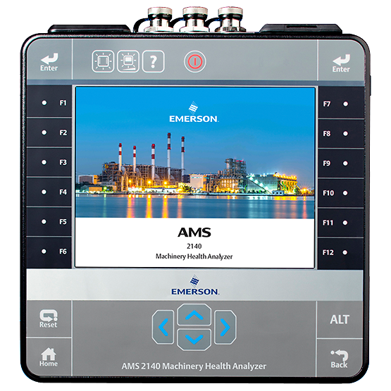
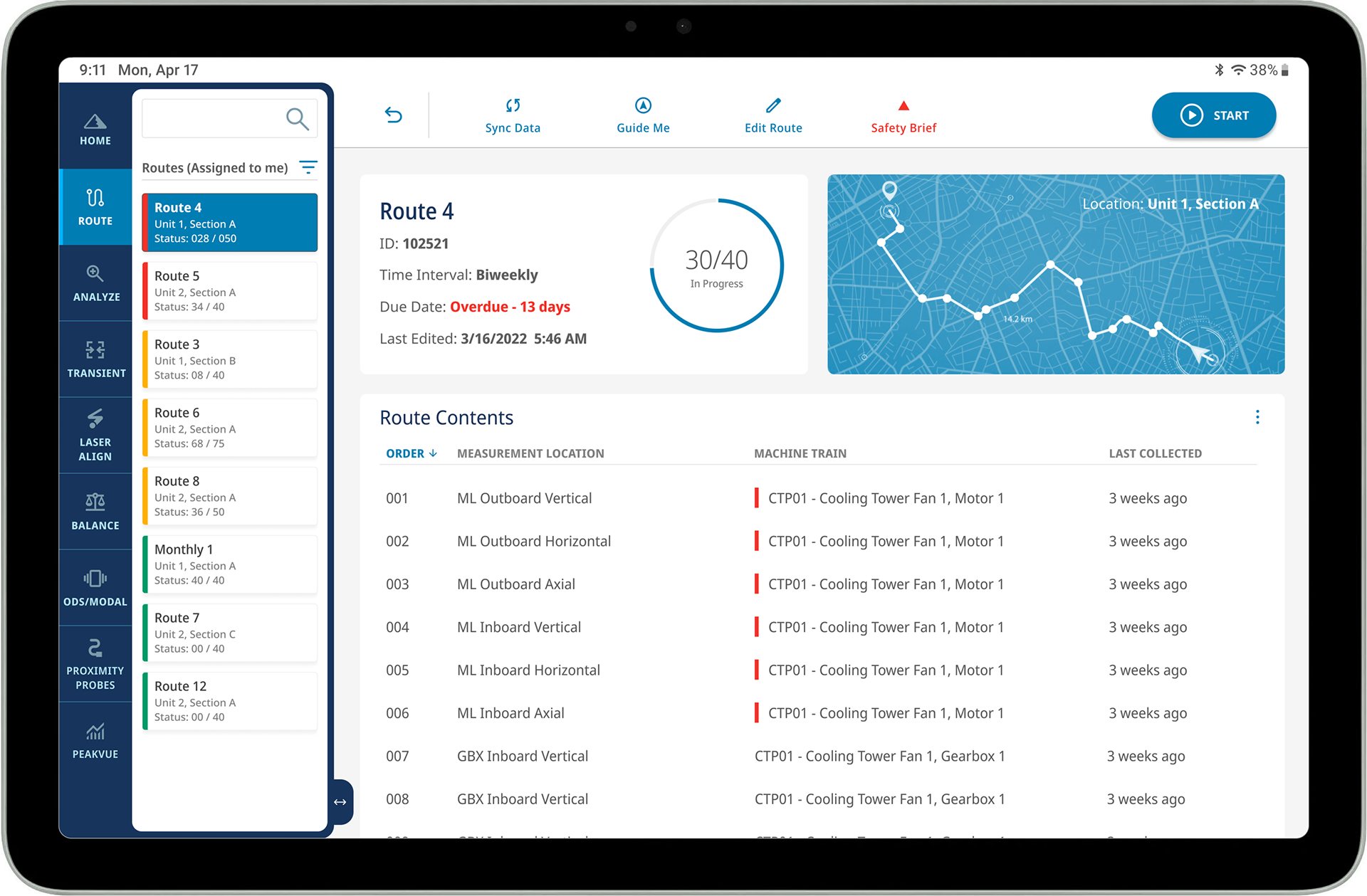
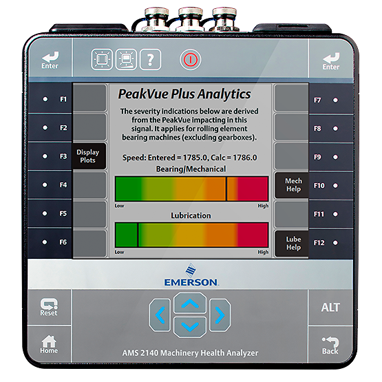
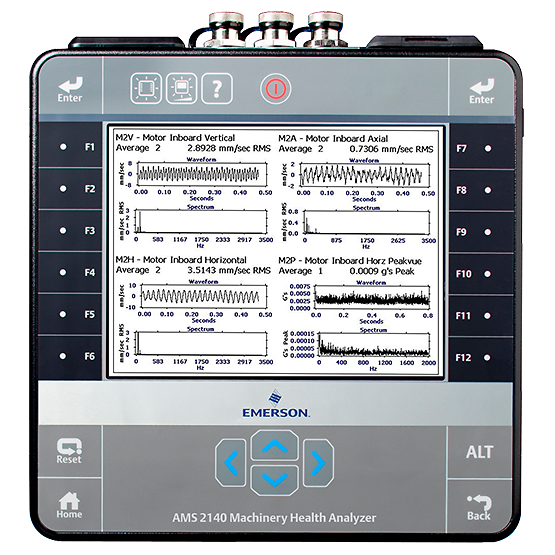
The company is shifting to Google Tablets for an updated hardware to compliment our redesigned software. Many of the features in the redesign were non existent in the older 2140 model.
TABLET PROTOTYPE
DARK MODE
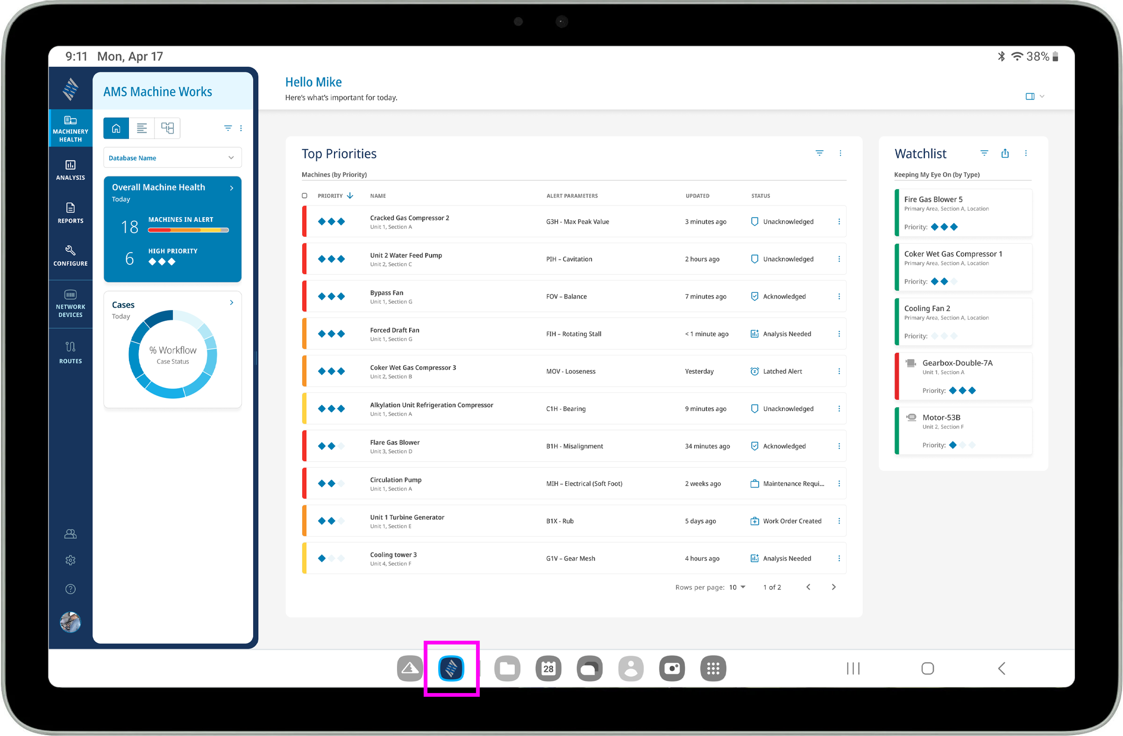
ACCESSING SEPARATE SYSTEMS
Users can now access the Machine Works Software from their Everest Tablet.
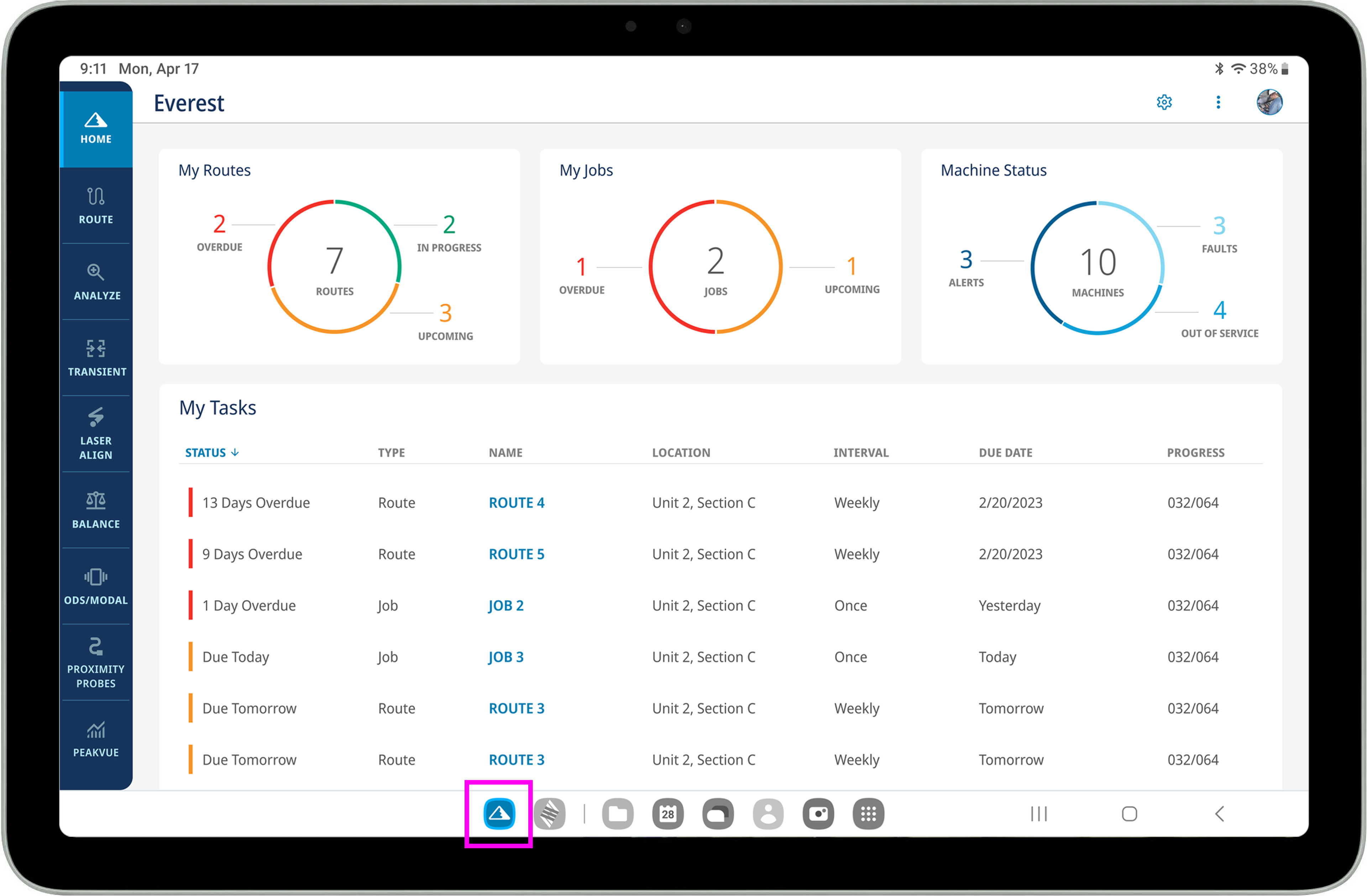
After observing how customers use their tablets in the fields (the bottom of the tablet resting on their sternum, propped at a 45 degree angle), it was thought better to have controls at the top of the screen for easier touch access.
We decided to give the customer an option to choose their preferred navigation layout.
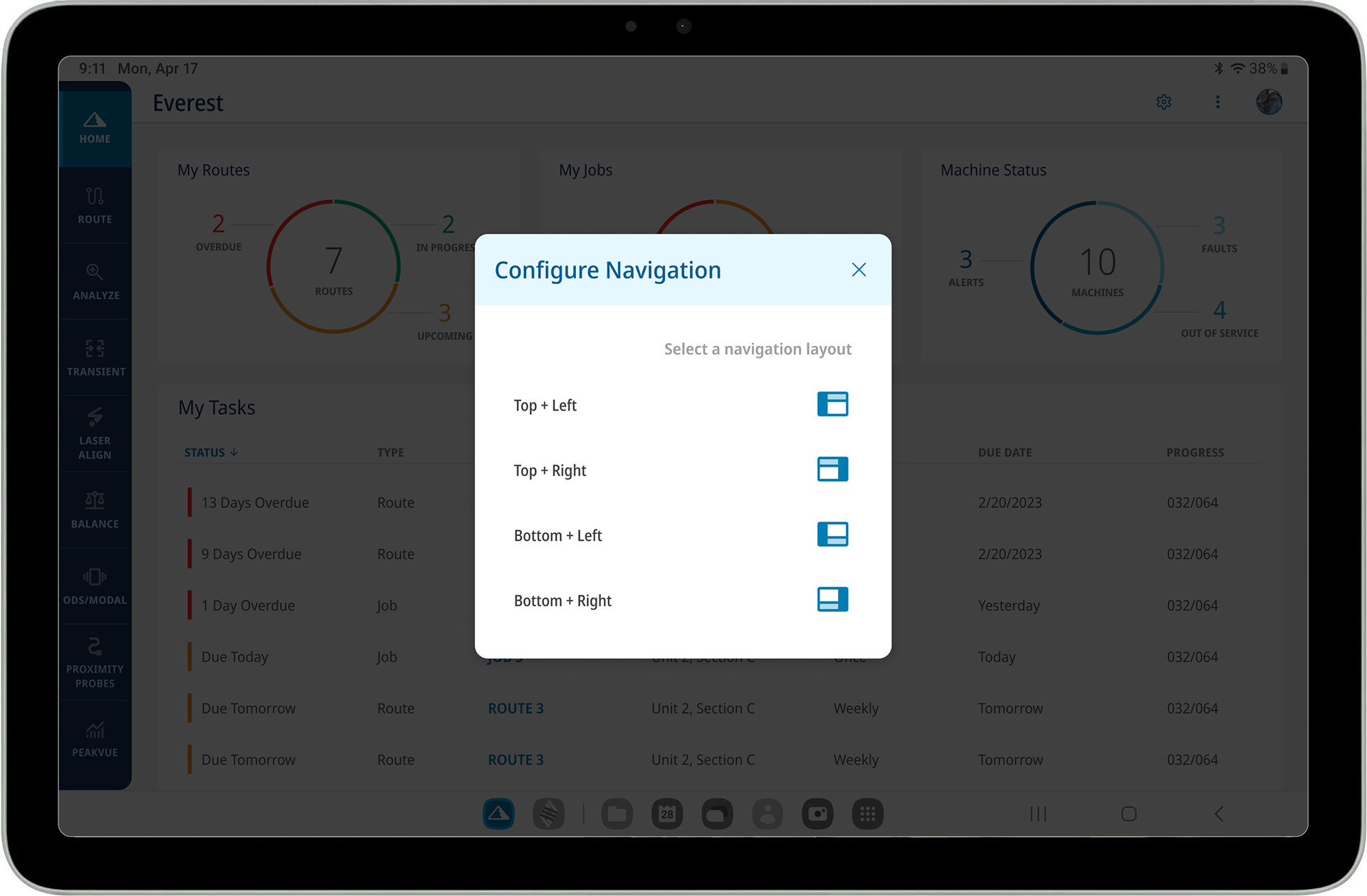

The Machine Status will display what is in need of critical attention, in hopes to prevent further damage and slow down or halt production.
During research meetings we learned how dangerous some routes can be. We included a safety brief to help avoid injuries or death.
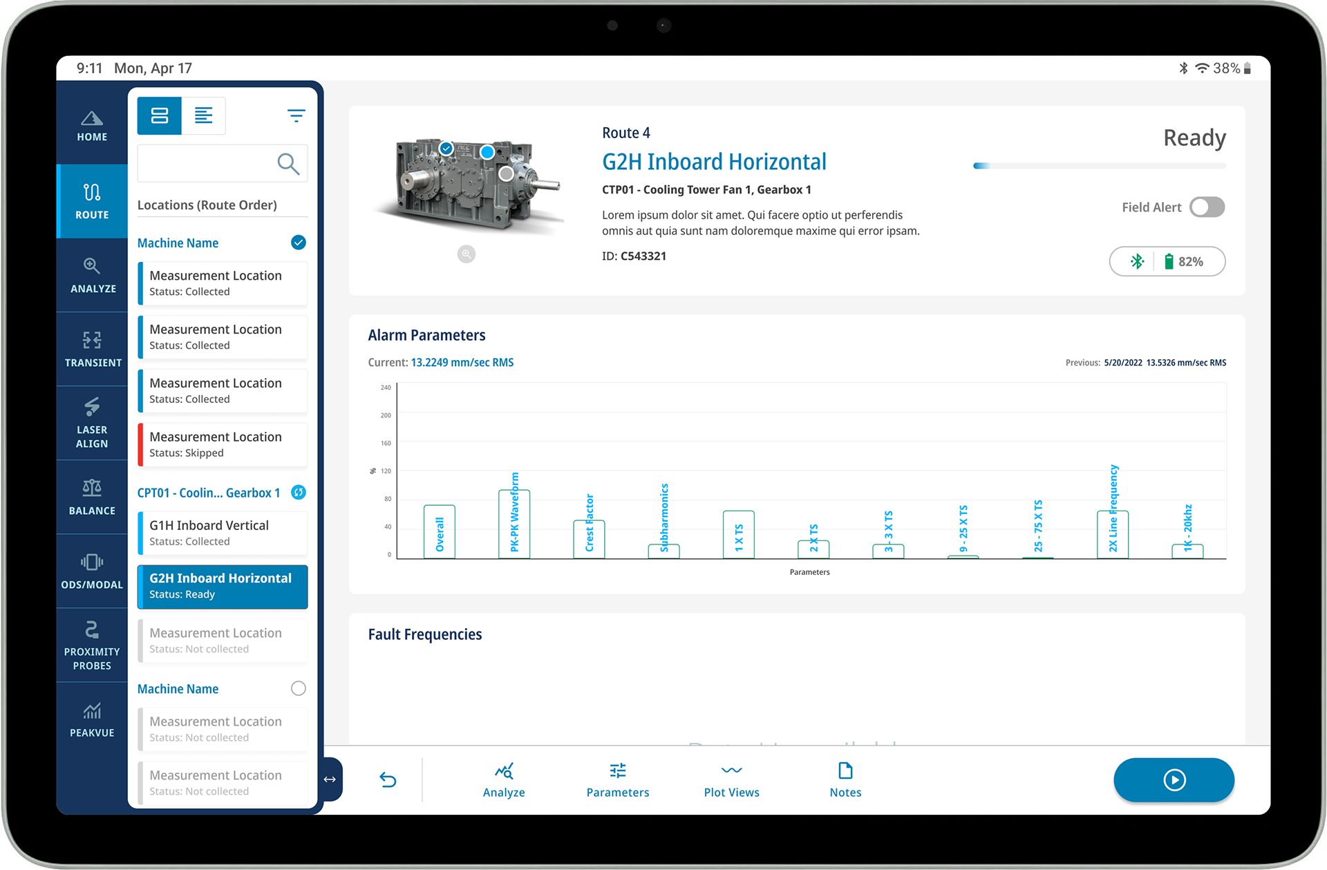
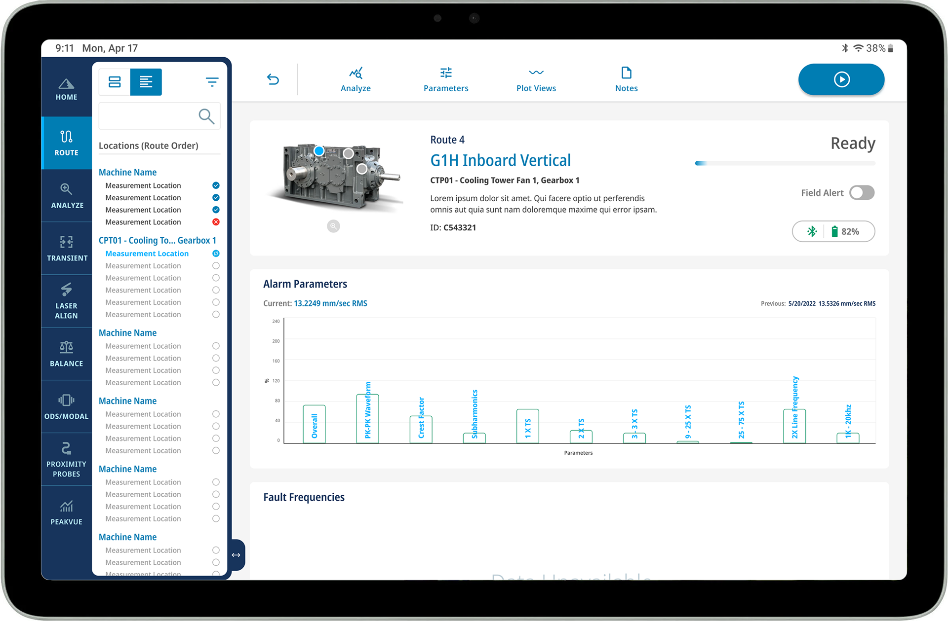
Some customers thought the card list view in the side menu panel (on the left) took up too much room and requested an option to view a condensed list (on the right).
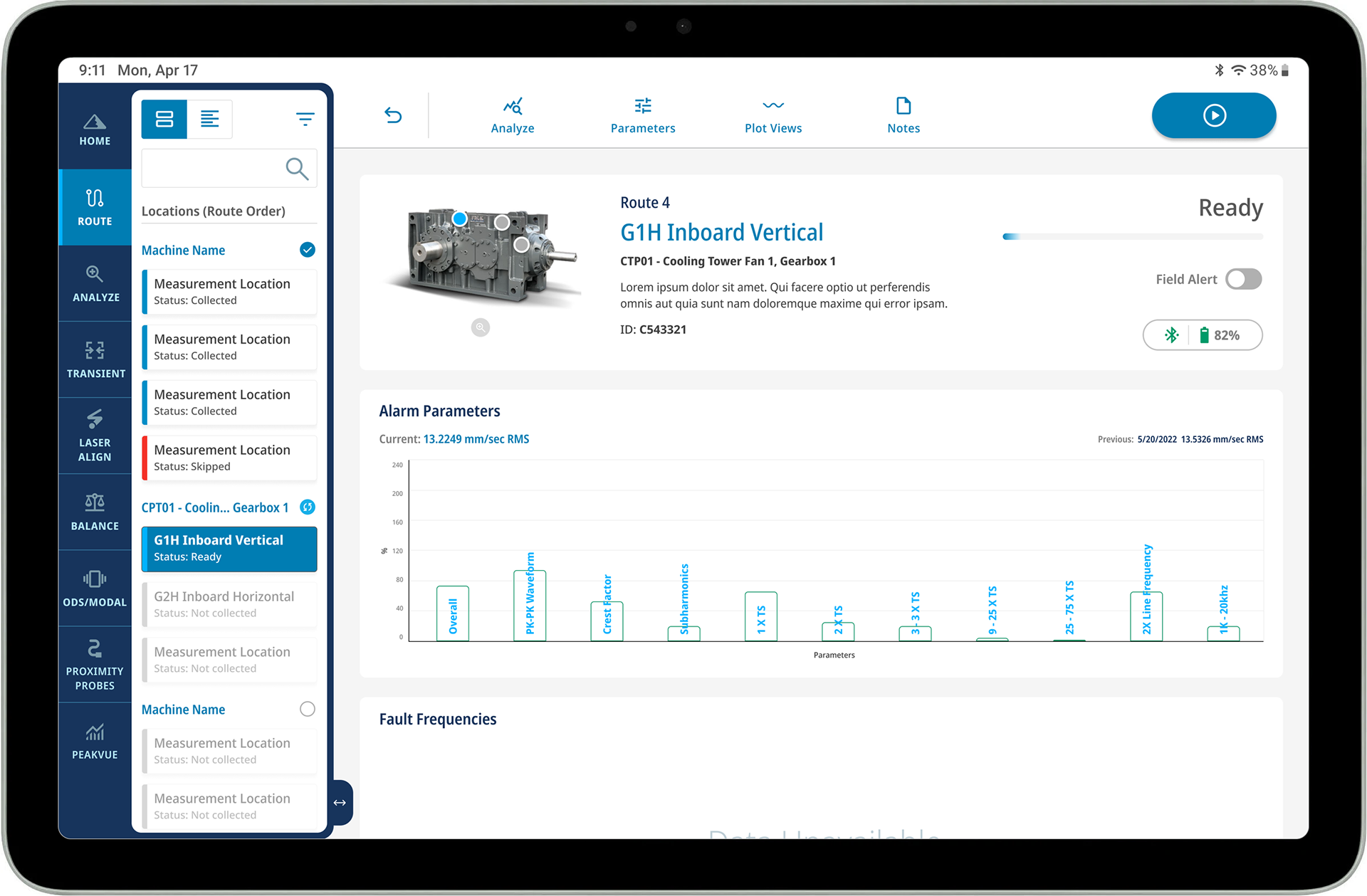
Once the start button (in the upper right control bar) is pressed, the button's color changes to indicate the measurement reading is taking place. In the upper content area there is also a change in the progress indicator bar and it's label from "Ready" to "In Progress".
On the machine image you'll notice there is a bright blue dot on the "measurement location" that is being recorded, while the grey dots are next in line.
A bright blue "retake" button has also appeared to the left, giving the option to retake the measurement (something the technicians requested). The previously bright blue dot on the machine image has turned into a mellow blue with a white check mark, indicating it's completion.
You'll notice the bright blue dot on the machine image has taken place from the once grey dot, indicating it's new location of what is being recorded.
In the above image, the Fault Frequencies card has an expand icon in the upper right corner which when clicked, gives the user an increased view of the spectrum, as seen below.
Depending on each user's preference, the specific plot views and their order of viewing can be managed from the control bar.
When a note is left for the technician's review, an red indicator will appear on the "notes" icon in the upper control bar.
Here users can review and share past notes, search key words, and add new notes. This was requested by technicians as they explained how helpful it is to understand machine issues, no matter how recent or dated.
Giving users the ability to upload their own photos, tag other team members, and creating a log through hashtags were all requested by customers.
The freshly posted note will be highlighted in bright blue, and like previous notes are time-stamped and have sharing ability.
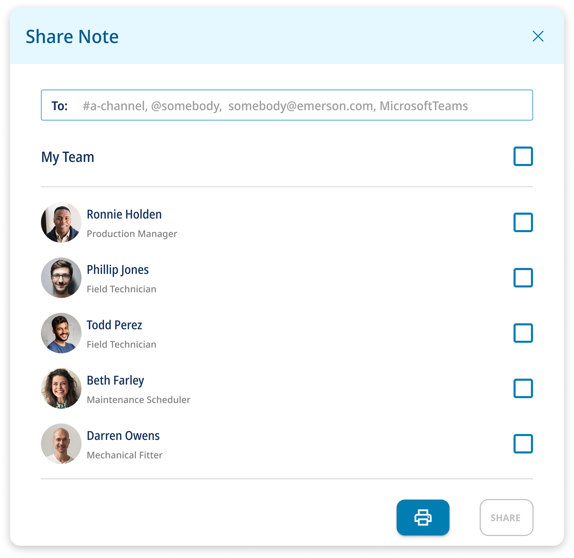
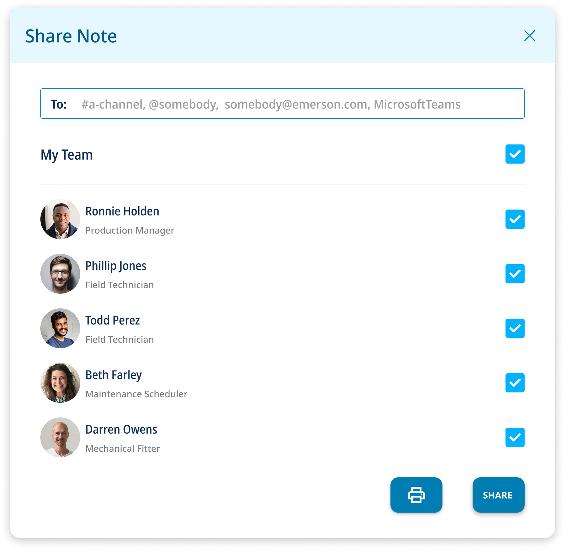
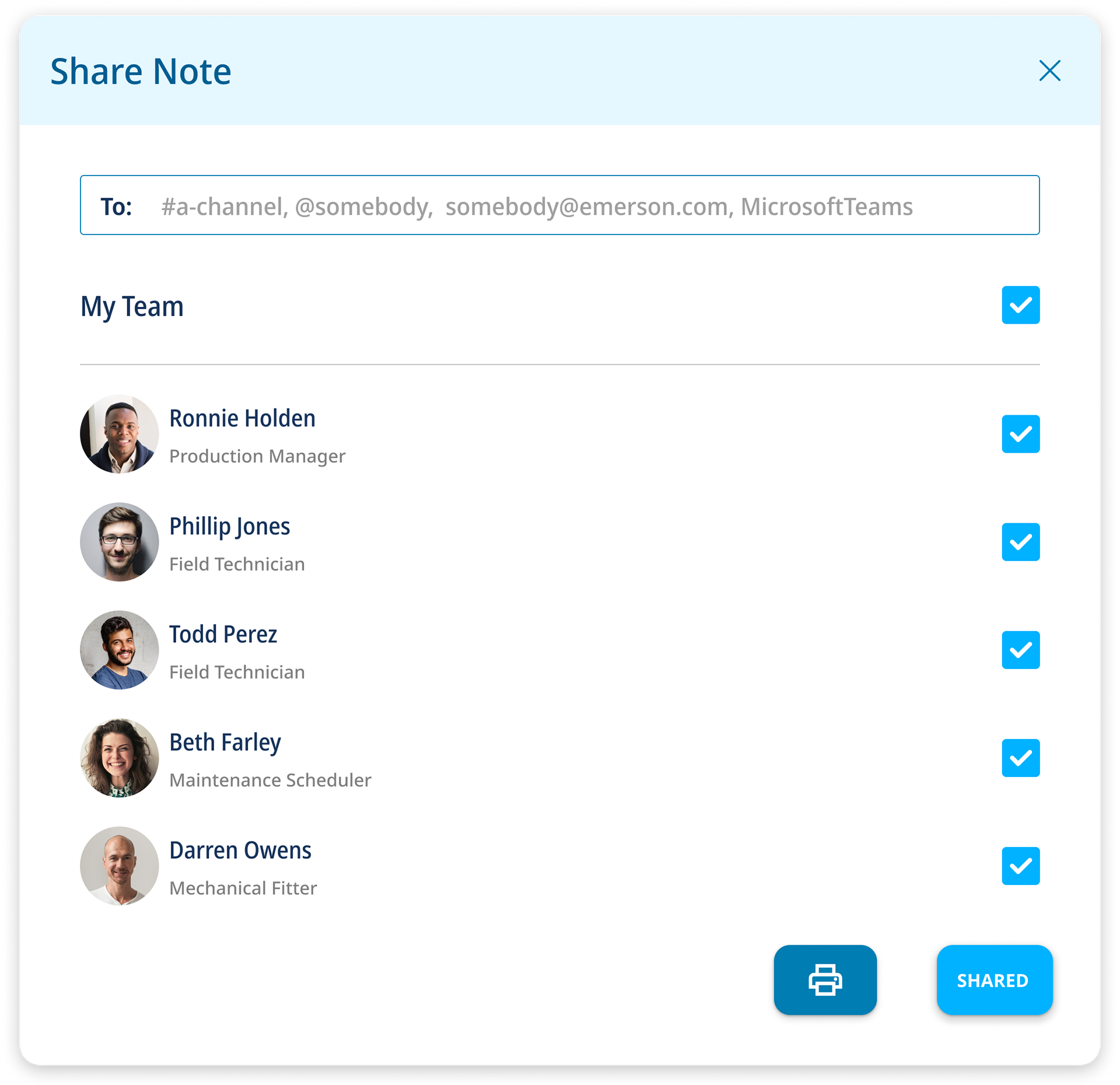
Users can type individuals outside of their team, select individuals from within their team, or entire team to share each note with. You can view the slight changes of the sharing journey in the OVERLAYS section below this image.
OVERLAYS
POST DESIGN CUSTOMER INTERVIEWS