The AMS Machine Works Machinery Health Software allocates data from many machines in a single location and identifies troublemakers quickly, so customers can start working towards solutions.
Client: Emerson
Platform: Android, Desktop
Deliverables: Research; mockups and prototype for desktop and mobile; customer interviews; interview summaries
Challenge: Revamp legacy software and design from the early 90's without access to the current software due to client's strict security protocols. Completely redesign entire look, feel, architecture of screen layouts, and information.
Objective: Monitoring machine health for optimal production through a modern, more user friendly, & collaborative interface.
To learn more about Machine Works and see it's latest development stage click here. Our design efforts are estimated to fully be in place by 2025-2026.
RESEARCH (pre-design)
Since this is a longstanding software with many siblings we decided to audit existing elements before beginning our designs.
BEFORE EXAMPLE
The original design of AMS Machine Works was very similar to Microsoft 90's with the ribbon tool bar, CTAs, navigation, sidebars, etc. Many concepts incorporated into the redesign did not exist in the initial software.
DESKTOP PROTOTYPE
MOBILE PROTOTYPE
MOBILE UI
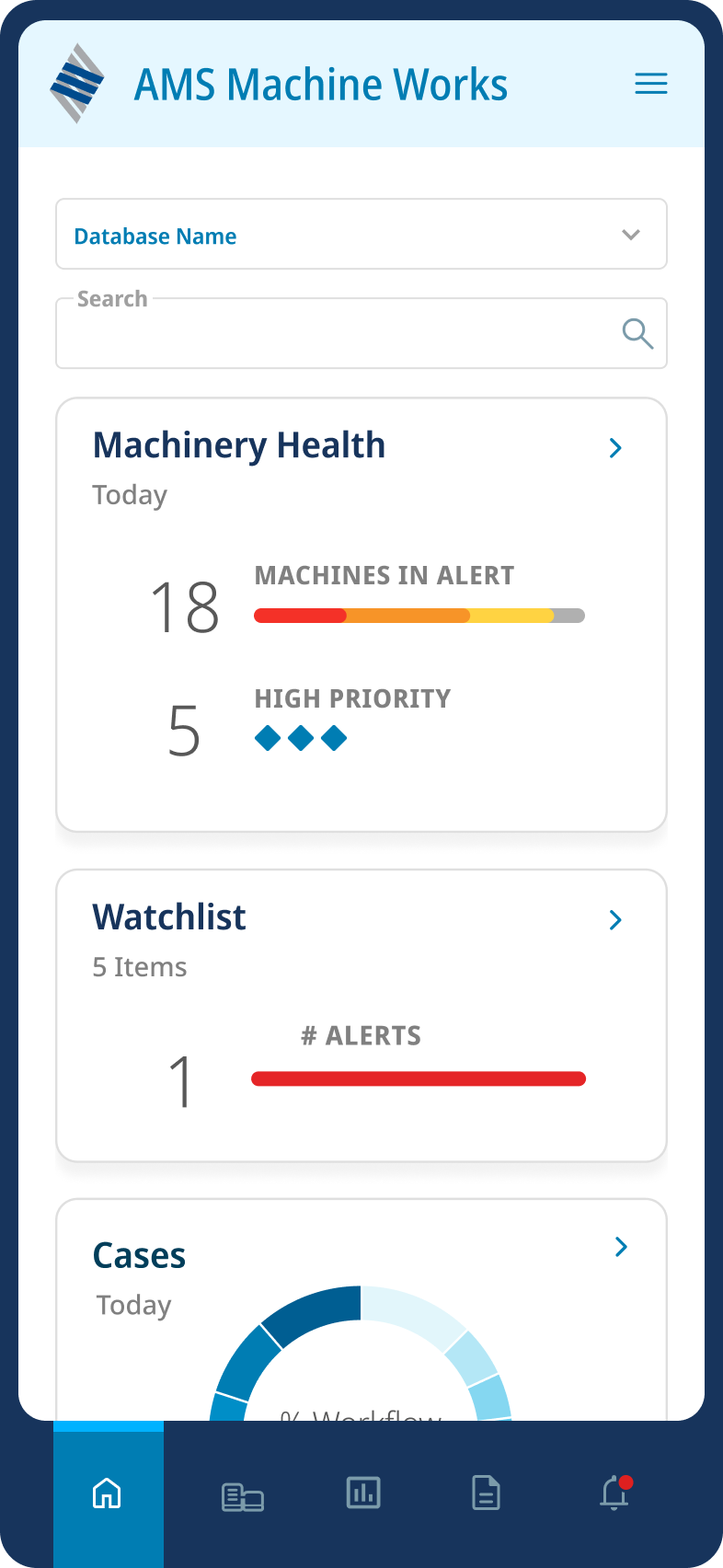
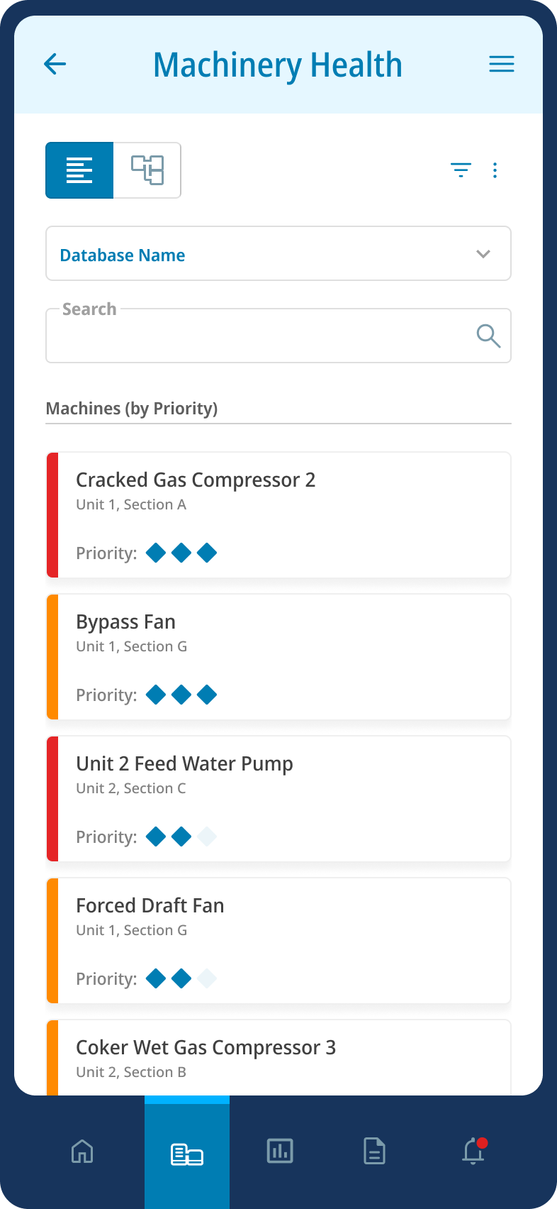
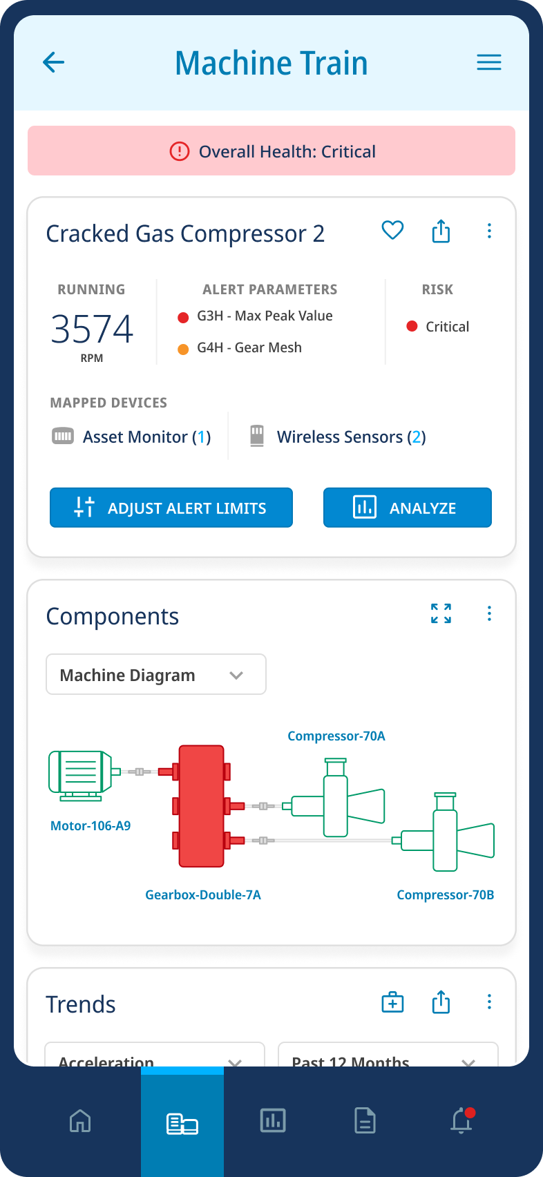
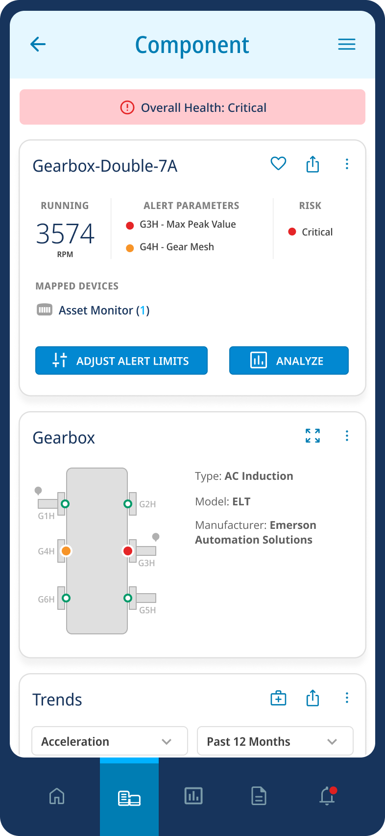
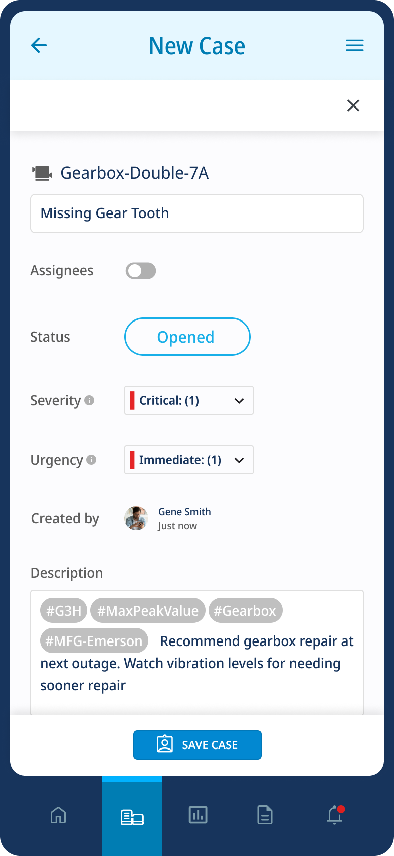
MOBILE UI FULL LENGTH


INFORMATION ARCHITECTURE
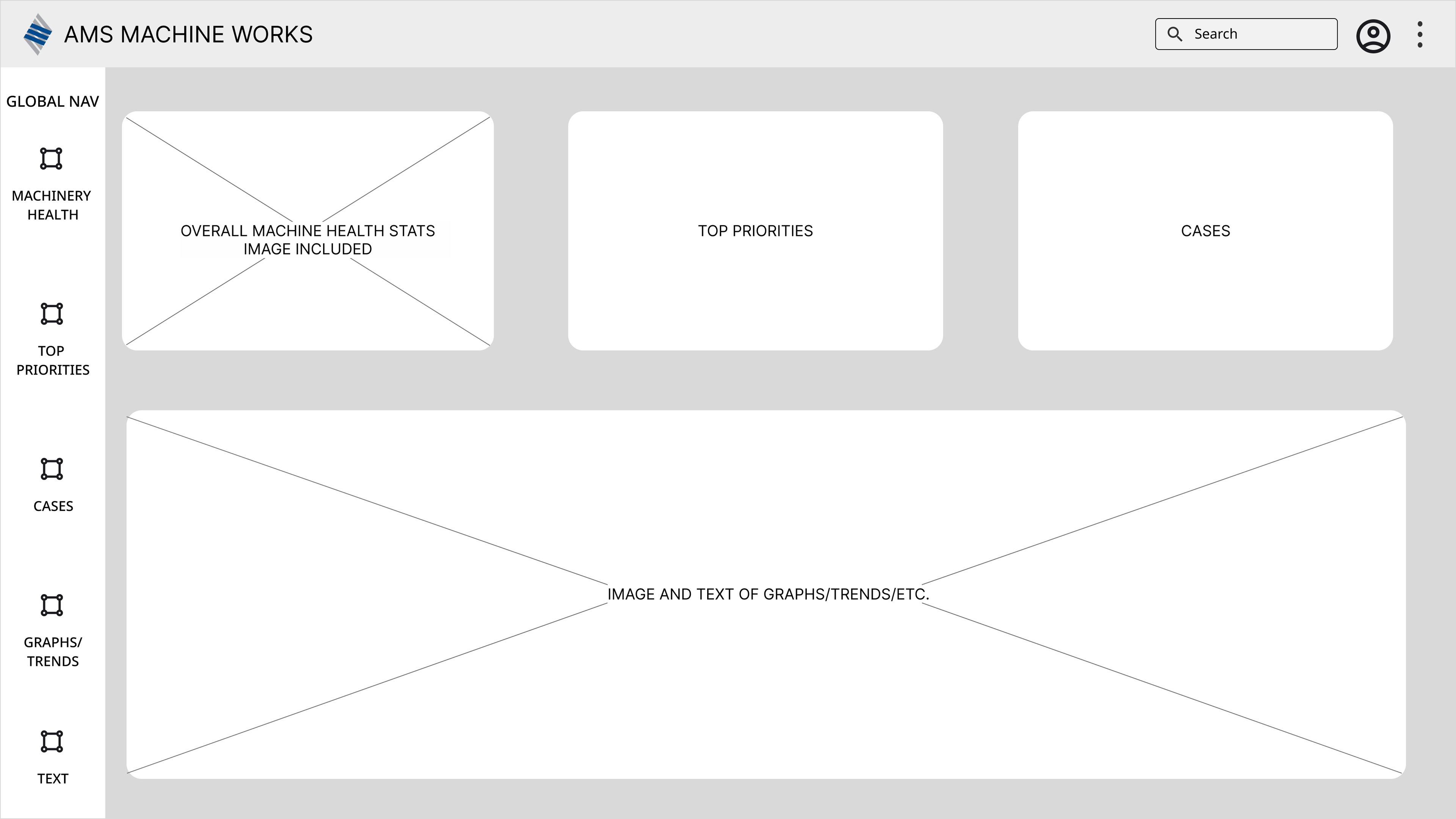
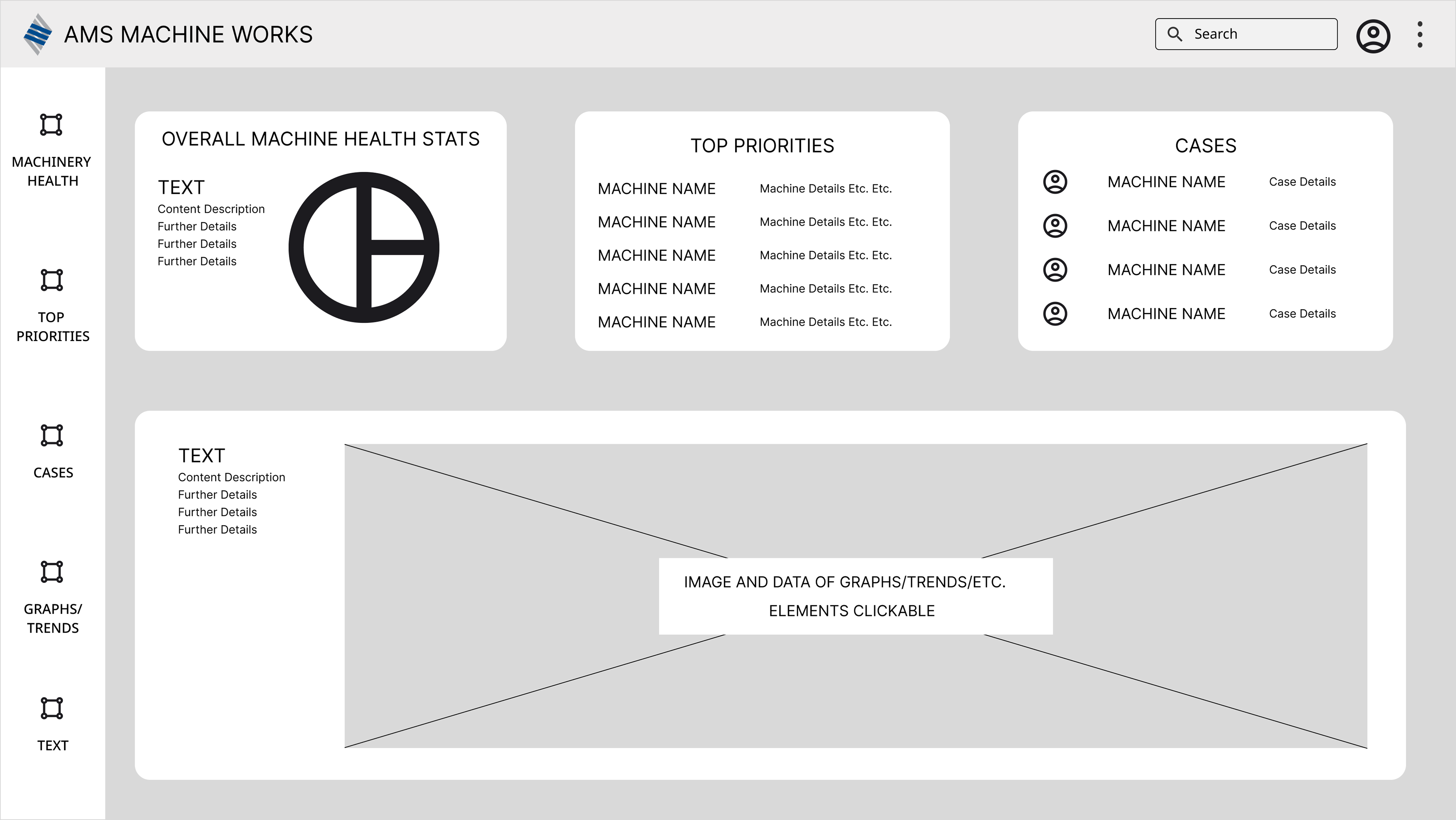
WIREFRAMES
CUSTOMER JOURNEY
MIKE WILL ANALYZE USING HIS DESKTOP
The client chose not to incorporate a daily task checklist for this redesign phase but kept the option in case.
Customers can switch between card or hierarchy list view with the segmented buttons in the top portion of the side menu.
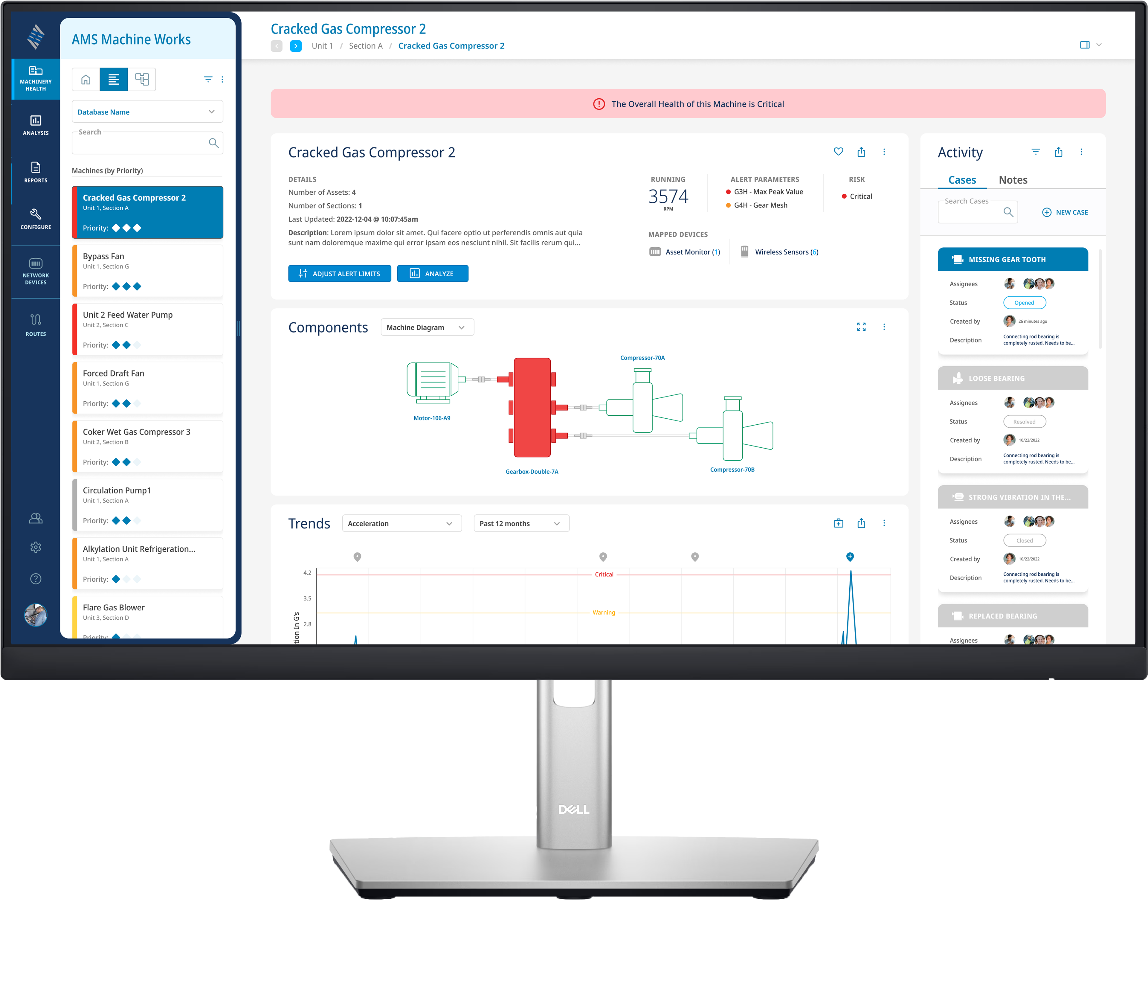
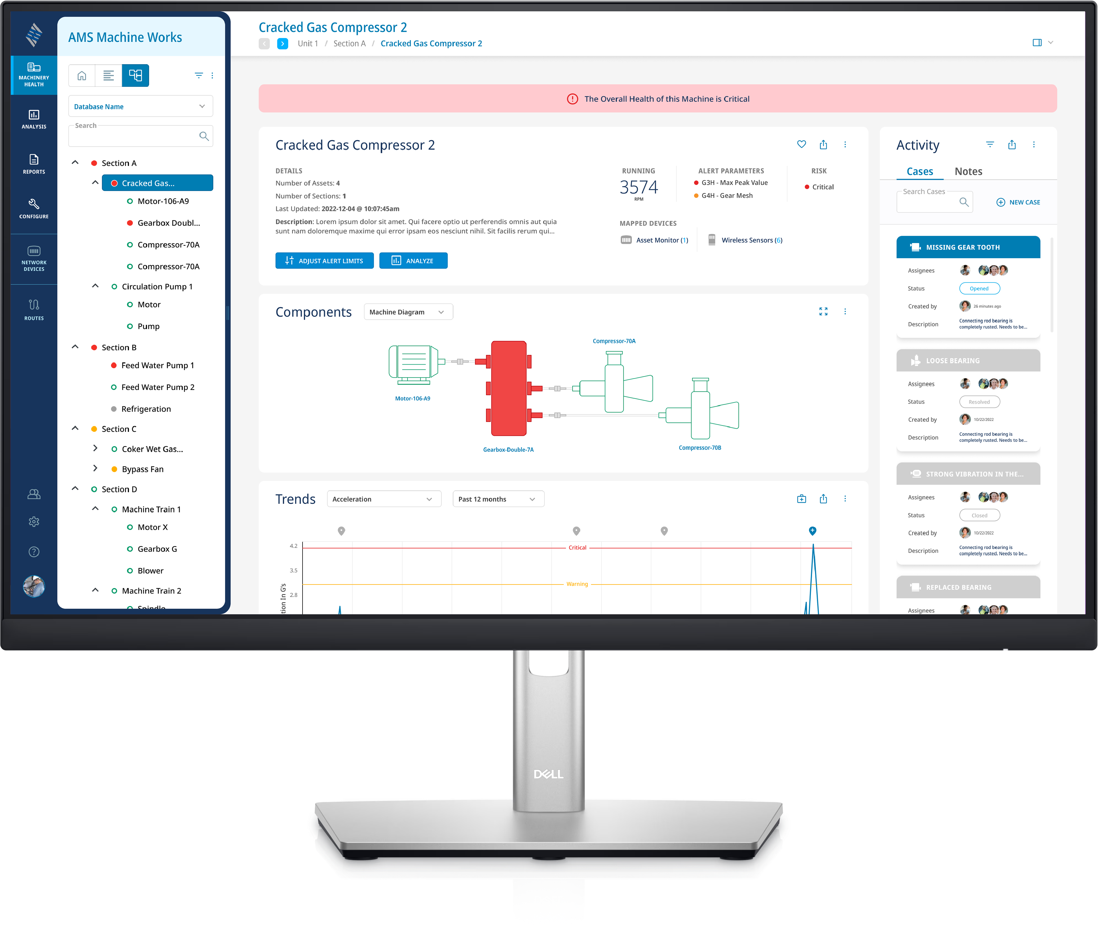
We are taken to the screen below by clicking on the red (critical) machine above, "Gearbox Double-7A", to inspect further details.
The "Activity" content area addressed a pain point for our users. Customers are currently not using the collaboration method since it is detached from the software details area, creating further steps to obtaining helpful information.
In order to view the detailed graphs/trends, users navigate from the "Machinery Health" icon in the Navigation bar to the "Analysis" icon. You'll notice the bright blue highlight is now covering the "Analysis" icon in the Navigation Bar.
CASES OVERLAYS
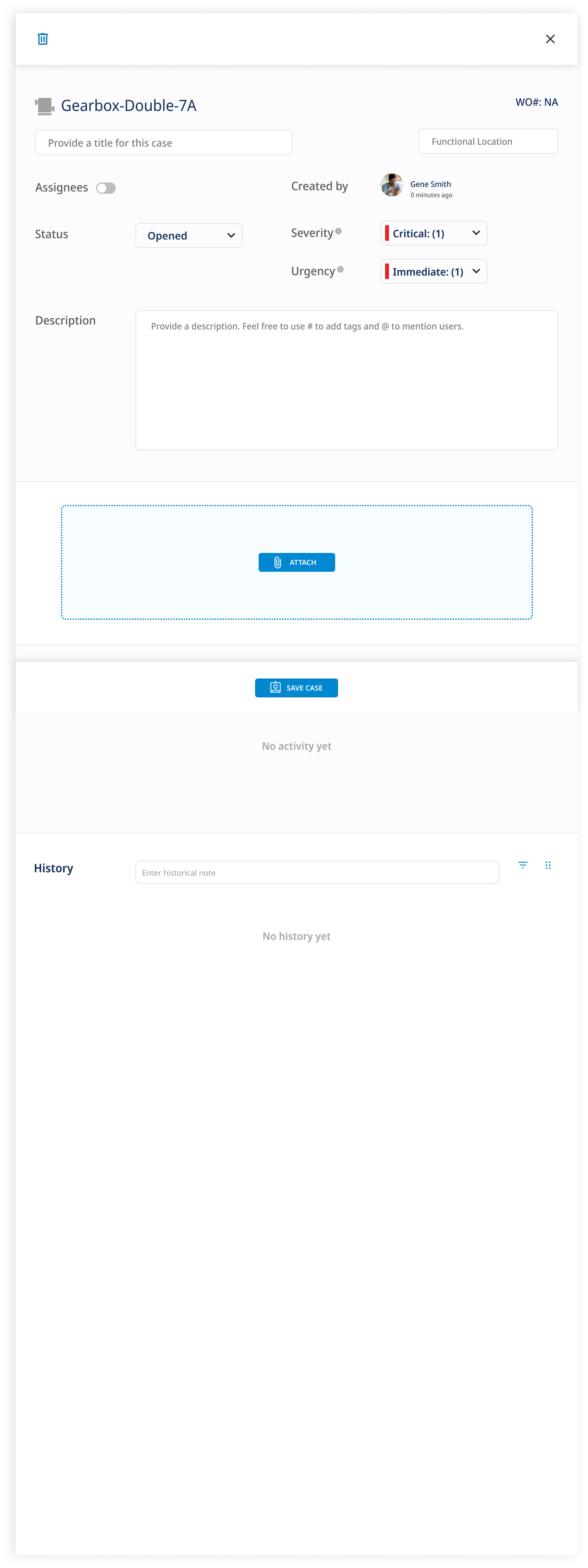
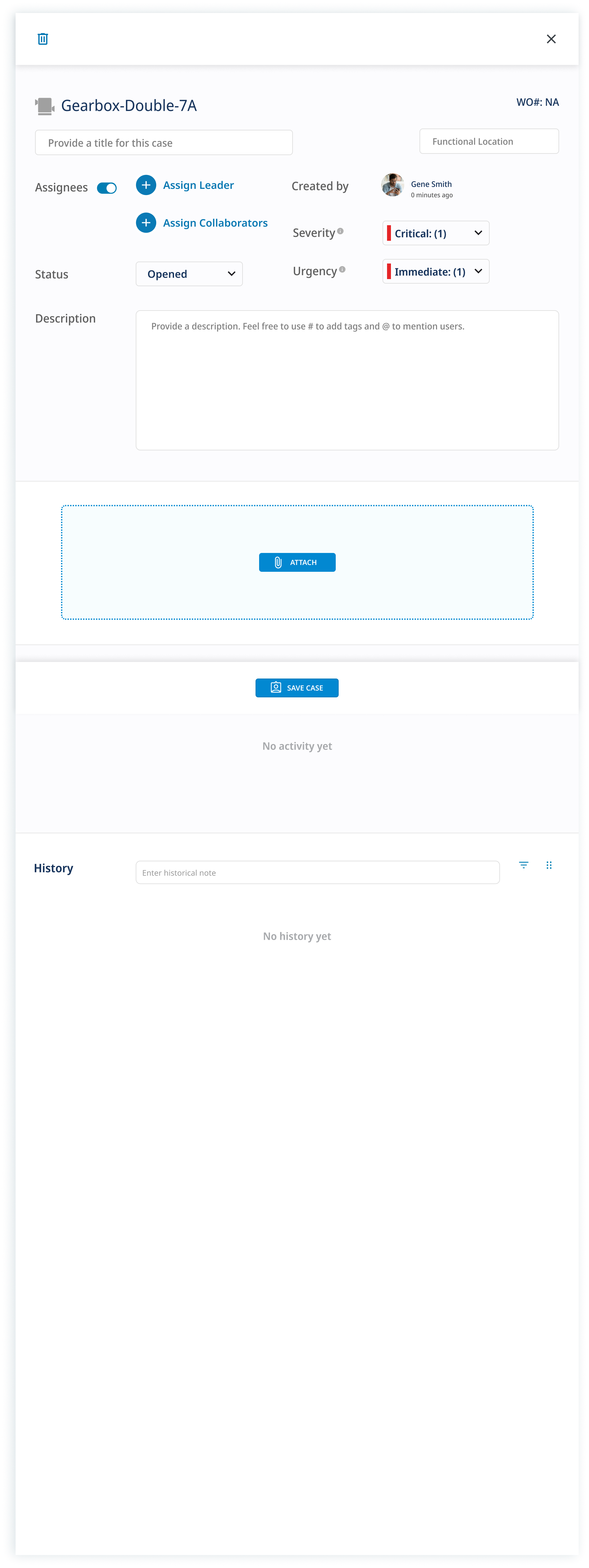
Creating "Cases" was an suggestion our team made in order to alleviate pain points customers were having with being unaware of the details of flagged machines. This would be a huge improvement to foster collaboration and improve timeliness of machine repair and getting production back on track.
CASES FULL LENGTH UI
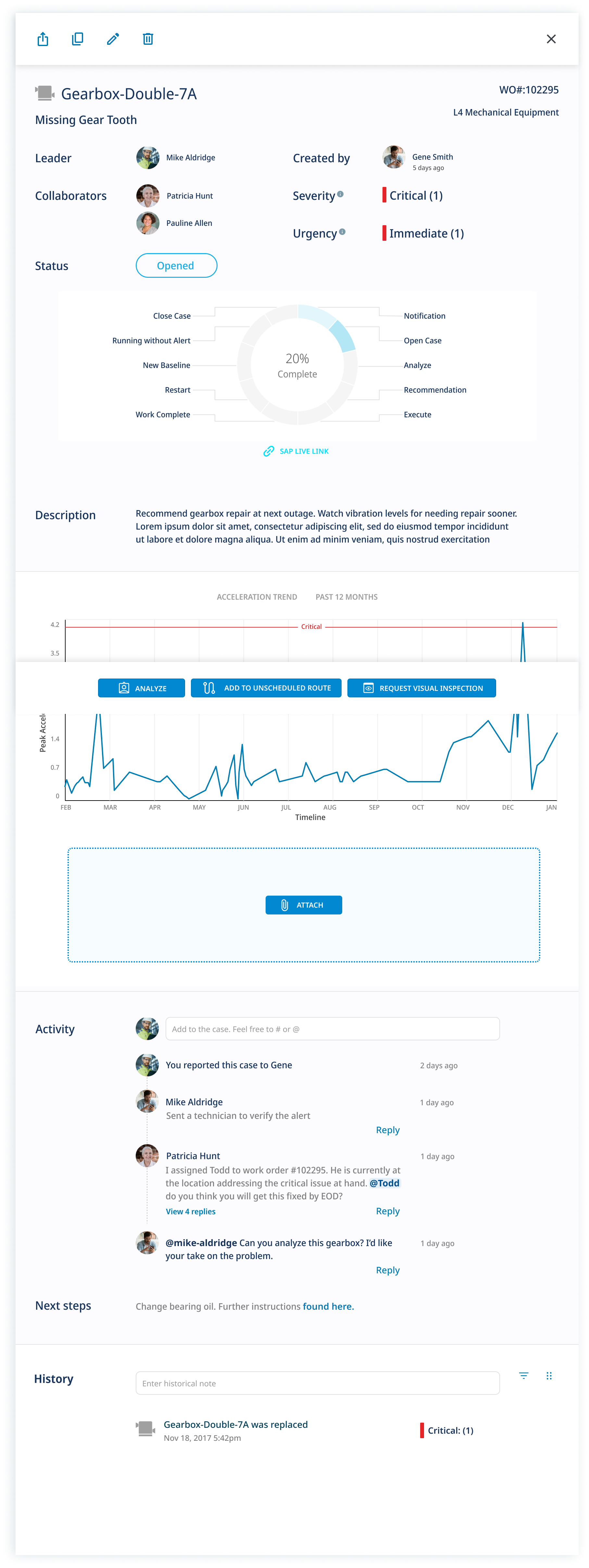
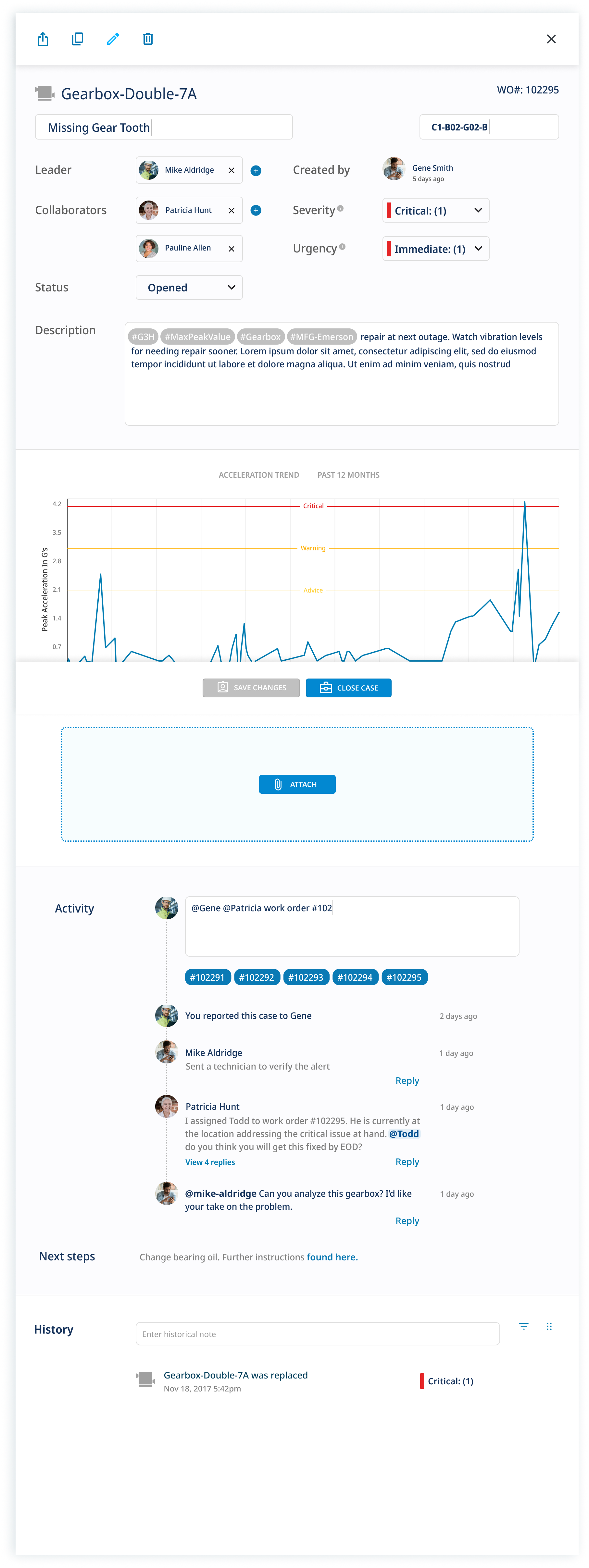
Customers from larger organizations wished to have more accountability and follow through for case management, while smaller organizations felt it was unnecessary.
We provided options to list who created a case, then a toggle option to include assigned leaders and collaborators, or not.
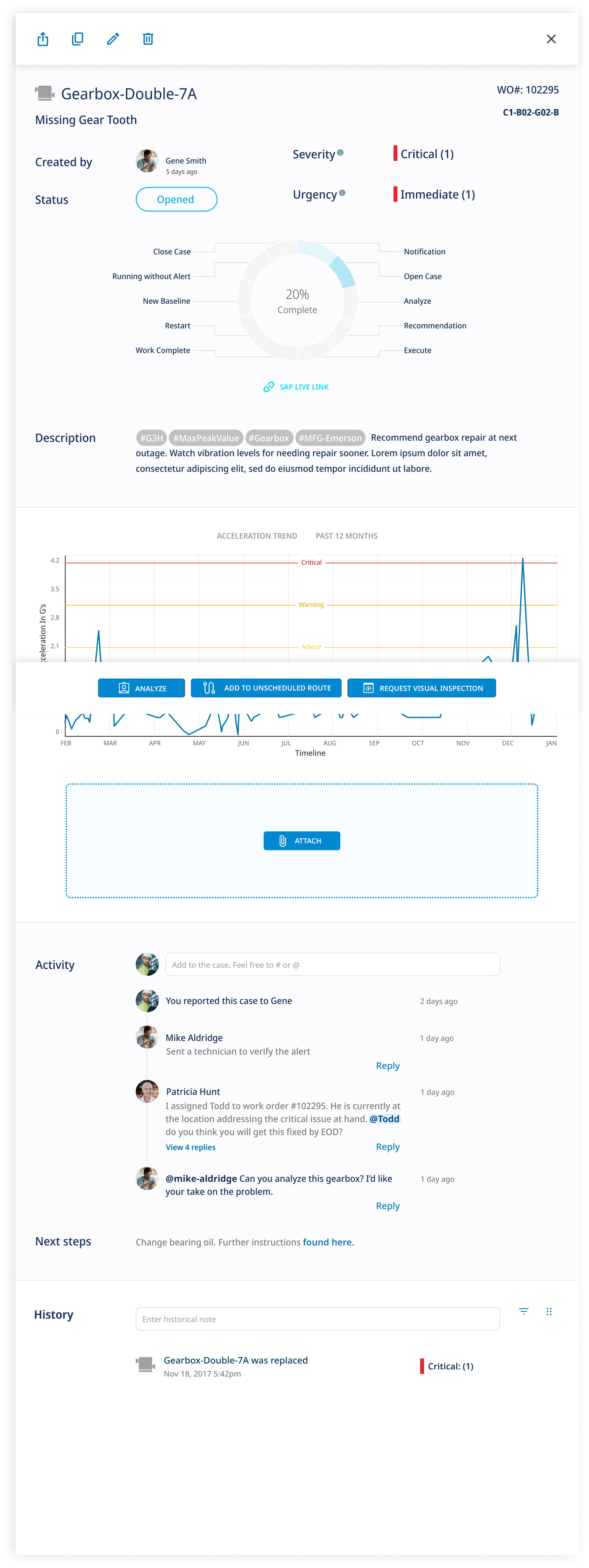
A collection of each machine's cases are condensed into cards within the "Cases" tab of the "Activity" side bar, from the machine details page.
POST DESIGN CUSTOMER INTERVIEWS